In this post, I am going to share a set of Python functions that can calculate the power spectral density, spectrogram, and persistence spectrum of a given (real or complex) one-dimensional signal. The functions are largely based on the Python library: Matplotlib. For demonstration purposes, the original codes are simplified to make them reader-friendly. I want to point out that the implementation of the persistence spectrum is original, and I found this plot is useful and can replace the spectrum in many aspects.
Stock functions
In the beginning, I want to show how to use stock matplotlib functions: specgram and psd. For comparison, I will recreate the test signal according to a Matlab document, where a narrowband signal is embedded within a broadband chirp signal. Keep an eye on the persistence spectrum in the example, and I will talk about it later.
1
2
3
4
5
6
7
8
9
10
import numpy as np
from scipy.signal import windows, chirp
import matplotlib.pyplot as plt

# generate the signal under test
fs = 1000
t = np.arange(0, 500, 1/fs)
x = chirp(t, 180, t[-1], 220) + 0.15 * np.random.randn(len(t))
idx = int(np.floor(len(x)/6))
x[:idx] = x[:idx] + 0.05*np.cos(2*np.pi*t[:idx]*210)
Then let’s plot the spectrogram and PSD. Under the hood, both of them are generated from the Short-Time Fourier Transform (STFT) of the signal. The process is very similar to the periodogram generation we talked before: in short, the signal is divided into small segments and the FFT is applied to each segment.
1
2
3
4
5
6
7
# generate the power spectral density
fig, ax = plt.subplots()
ax.psd(x, Fs=fs)
ax.set_xlim([100, 290])
ax.set_ylim([-45, -15])
ax.set_yticks(np.arange(-45, -10, 5))
plt.show()

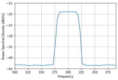
Here I will keep all arguments as default. We can only see the PSD of the wideband chirp signal, and the weak single tone is disappeared.
1
2
3
4
5
6
7
# generate the spctrogram
figure, axes = plt.subplots()
[spectrum, freqs, t, _] = axes.specgram(x, NFFT=512, Fs=fs, noverlap=256, cmap="jet", vmin=-50, vmax=0)
axes.set_ylim([100, 290])
axes.set_xlabel('Time (minutes)')
axes.set_ylabel('Frequency (Hz)')
plt.show()

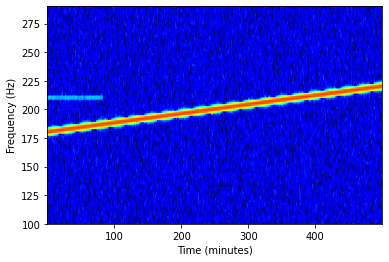
Now we can see both signals in the spectrogram. The overlap argument indicates the number of overlapped samples of two nearby segments, which can reduce the noise interference, at the cost of reduced frequency resolution and more computation. This is a major improvement of Welch’s Method from the original periodogram. I choose “jet” for the color map argument cmap, because it is the closest to the default Matlab color map.
Spectrogram and PSD
To plot our own PSD and spectrogram, we first need two helper functions.
1
2
3
4
5
6
7
8
9
10
11
12
13
14
15
def _stride_windows(x, n, noverlap=0):
    """
    a simplified version of matplotlib function with the same name
    https://github.com/matplotlib/matplotlib/blob/710fce3df95e22701bd68bf6af2c8adbc9d67a79/lib/matplotlib/mlab.py#L218
    more about as_strided function
    https://zhuanlan.zhihu.com/p/64933417
    """
    noverlap = int(noverlap)
    n = int(n)

    step = n - noverlap
    shape = (n, (x.shape[-1]-noverlap)//step)
    strides = (x.strides[0], step*x.strides[0])

    return np.lib.stride_tricks.as_strided(x, shape=shape, strides=strides)
This helper is used to generate signal segments with overlaps. We can also directly reshape the input signal into a two-dimensional matrix if no overlap is required.
1
2
3
4
5
6
7
8
9
10
11
12
13
14
15
16
17
18
19
20
21
22
23
24
25
26
27
28
29
30
31
32
33
34
35
36
37
38
39
40
def _spectral_helper(x, Fs=1, NFFT=1024, noverlap=0):
    """
    spectrual help for spectrum, spectrogram, and persistence spectrum
    NFFT is assumed to be the power of 2, at least is an even number
    """
    # segmentation and windowing
    # window = np.hanning(NFFT)
    # Kaiser window is used in Matlab
    window = np.kaiser(NFFT, 20)
    result = _stride_windows(x, NFFT, noverlap)
    result = result * window.reshape((-1, 1))
    # fft to each frame
    result = np.fft.fft(result, n=NFFT, axis=0)
    # convert to power
    result = np.real(np.conj(result) * result)
    freqs = np.fft.fftfreq(NFFT, 1/Fs)

    if np.iscomplex(x[0]):
        # twosided
        # center the frequency range at zero (fftshift)
        freqs = np.fft.fftshift(freqs, axes=0)
        result = np.fft.fftshift(result, axes=0)
    else:
        # onesided
        result = result[:NFFT//2 + 1, :]
        # scale for onesided spectrum, skip the DC
        result[1:, :] *= 2
        freqs = freqs[:NFFT//2 + 1]
        # get the last value correctly, it is negative otherwise
        freqs[-1] *= -1

    # divides by the sampling frequency so that density function has
    # units of dB/Hz and can be integrated by the plotted frequency value
    result /= Fs
    # Scale the spectrum by the norm of the window to compensate for
    # windowing loss; see Bendat & Piersol Sec 11.5.2.
    result /= (np.abs(window)**2).sum()
    t = np.arange(NFFT/2, len(x) - NFFT/2 + 1, NFFT - noverlap)/Fs

    return result, freqs, t
This is the core function of STFT computation. It processes the signal in the following steps:
- Each data segment is multiplied by the Kaiser window.
- Apply FFT to each segment and convert it to power.
- For complex signals, shift the result such that the DC is in the middle; for real signals, discard the negative frequency components and double the positive components.
- Normalize the results by the sampling frequency and the energy of the window.
Make sure to follow all the steps to get the right power value.
1
2
3
4
5
6
7
8
9
10
11
12
Fs = 1000
NFFT = 1024
noverlap = 782
result, freqs, t = _spectral_helper(x, Fs, NFFT=NFFT, noverlap=noverlap)
psd = 10 * np.log10(result.mean(axis=1))
fig, ax = plt.subplots()
ax.plot(freqs, psd)
ax.set_xlabel('Frequency')
ax.set_ylabel('Power Spectral Density (dB/Hz)')
ax.grid(True)
ax.set_xlim([100, 290])
plt.show()
So the PSD can be derived from the STFT result by averaging in time. Don’t forget to convert it to the dB scale.
Next is the spectrogram.
1
2
3
4
5
6
7
8
9
10
11
12
13
14
15
16
17
18
19
stft = 10 * np.log10(result + 1e-6)
# find the extent in time and freq
pad_xextent = (NFFT-noverlap) / Fs / 2
xmin, xmax = np.min(t) - pad_xextent, np.max(t) + pad_xextent
extent = xmin, xmax, freqs[0], freqs[-1]

pwr_min, pwr_max = -50, 0
fig, ax = plt.subplots()
ax.imshow(
    stft, cmap="jet",
    extent=extent,
    vmin=pwr_min,
    vmax=pwr_max,
    origin='lower'
)
ax.set_ylim([100, 290])
ax.set_ylabel('Frequency')
ax.set_xlabel('time')
plt.show()
It is basically to use imshow() to display the STFT results. However, there are some tricky points:
- The linear STFT value is converted to the dB scale. Note that you can only average the linear scaled STFT results, therefore, I can’t do it before the PSD plotting.
- The added small number, 1e-6 into linear scaled STFT is to avoid the potential log(0) that gives us negative infinity.
- Manually decide the “extent” and “vmin”, “vmax” to get the best
imshow()display range. - Don’t forget to set the “origin” argument to “lower”, otherwise, the default will make the frequency axis flip.
The plots are alomst identical to the plots above, so I will not paste them twice.
Persistence spectrum
The persistence spectrum is a beautiful way to display the time-variant signals. Someone call it intensity graded persistence display. I want to again quote this Matlab document to explain it:
The persistence spectrum of a signal is a time-frequency view that shows the percentage of the time that a given frequency is present in a signal. The persistence spectrum is a histogram in power-frequency space. The longer a particular frequency persists in a signal as the signal evolves, the higher its time percentage and thus the brighter or “hotter” its color in the display. Use the persistence spectrum to identify signals hidden in other signals.
So, it is a histogram of the STFT results, I am going to use np.histogram() function to plot it:
1
2
3
4
5
6
7
8
9
10
11
12
13
14
15
16
17
18
19
20
21
22
23
24
nbins = 256
pspectrum = np.zeros((nbins, len(freqs)))
for idx_f in range(len(freqs)):
    pspectrum[:, idx_f], _ = np.histogram(
        stft[idx_f, :],
        bins=np.linspace(pwr_min, pwr_max, nbins+1),
        density=False
    )
pspectrum = np.log(pspectrum + 0.5)

fig, ax = plt.subplots()
ax.imshow(
    pspectrum,
    aspect="auto",
    cmap="jet",
    extent=(freqs[0], freqs[-1], pwr_min, pwr_max),
    origin='lower',
    # vmin=-1,
    # vmax=3.
)
ax.set_xlim([100, 290])
ax.set_xlabel('Frequency (Hz)')
ax.set_ylabel('Power Spectrum (dB/Hz)')
plt.show()
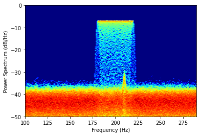
For each frequency slot, I generate a histogram from the log STFT result. To enhance the low power signals, another log is applied to the histogram result. Finally, use the imshow() function to plot the persistence spectrum just like the spectrogram.

Now, we can see both signals in the persistence spectrum. That is why I prefer it over the normal PSD plot.
Noise floor issue
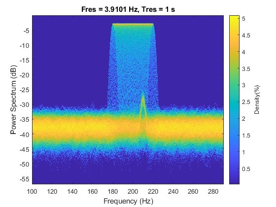
But if you take a look at the noise floor of my plot, it is about 6 dB lower than the plot from Matlab’s document. It confused me for quite a while. After a few unsuccessful communication with Mathworks after service, I finally found the reason.

In my plot, the unit of the power is dB/Hz, in other words, the power is measured in a frequency bin of 1 Hz. And the plot from Matlab has a frequency resolution of about 4 Hz, so the power is measured in a frequency bin of 4 Hz. That is why the unit on the y-axis only says dB, not dB/Hz as it used to be. Therefore, the power measure in Matlab’s plot is 4 times higher (6 dB) higher than my plot. Mysteries solved!
It’s all yours
you can download and/or test my code here. I think this concludes today’s post. See you next time.
Comments powered by Disqus.